Share of Renewable Energy Production in the World
The National Bureau of Economic Research (NBER) has a a very interesting dataset on the adoption of about 200 technologies in more than 150 countries since 1800. This is the Cross-country Historical Adoption of Technology (CHAT) dataset.
The following is a description of the variables
| variable | class | description |
|---|---|---|
| variable | character | Variable name |
| label | character | Label for variable |
| iso3c | character | Country code |
| year | double | Year |
| group | character | Group (consumption/production) |
| category | character | Category |
| value | double | Value (related to label) |
technology <- readr::read_csv('https://raw.githubusercontent.com/rfordatascience/tidytuesday/master/data/2022/2022-07-19/technology.csv')

#get all technologies
labels <- technology %>%
  distinct(variable, label)

# Get country names using 'countrycode' package
technology <- technology %>%
  filter(iso3c != "XCD") %>%
  mutate(iso3c = recode(iso3c, "ROM" = "ROU"),
         country = countrycode(iso3c, origin = "iso3c", destination = "country.name"),
         country = case_when(
           iso3c == "ANT" ~ "Netherlands Antilles",
           iso3c == "CSK" ~ "Czechoslovakia",
           iso3c == "XKX" ~ "Kosovo",
           TRUE           ~ country))

#make smaller dataframe on energy
energy <- technology %>%
  filter(category == "Energy")

# download CO2 per capita from World Bank using {wbstats} package
# https://data.worldbank.org/indicator/EN.ATM.CO2E.PC
co2_percap <- wb_data(country = "countries_only",
                      indicator = "EN.ATM.CO2E.PC",
                      start_date = 1970,
                      end_date = 2022,
                      return_wide=FALSE) %>%
  filter(!is.na(value)) %>%
  #drop unwanted variables
  select(-c(unit, obs_status, footnote, last_updated))

# get a list of countries and their characteristics
# we just want to get the region a country is in and its income level
countries <-  wb_cachelist$countries %>%
  select(iso3c,region,income_level)
This is a very rich data set, not just for energy and CO2 data, but for many other technologies. In our case, the emphasis is on data manipulation, rather than making the graphs gorgeous.
Firstly, we produce a graph with the countries with the highest and lowest % contribution of renewables in energy production. This is made up of elec_hydro, elec_solar, elec_wind, and elec_renew_other. We use the patchwork package to assemble the two charts next to each other.
library(patchwork)

en_new <- energy %>%  #filter energy dataset for year + create new variable for all renewable energy
  filter(year == 2019) %>%
  group_by(country, variable) %>%
  summarise(count = sum(value)) %>%
  ungroup() %>%
  pivot_wider(names_from = "variable", values_from = "count") %>%
  mutate(renew_en = elec_hydro + elec_solar + elec_wind + elec_renew_other)

en_new[is.na(en_new)] <- 0 #establish renewable energy usage as a percentage of energy as a whole
en_new <- en_new %>%
mutate(percent = renew_en/ elecprod*100) %>%
arrange(desc(percent)) %>%
filter(renew_en != 0, percent != Inf)
en_new
## # A tibble: 196 × 13
## country elec_…¹ elec_…² elec_…³ elec_…⁴ elec_…⁵ elec_…⁶ elec_…⁷ elec_…⁸
## <chr> <dbl> <dbl> <dbl> <dbl> <dbl> <dbl> <dbl> <dbl>
## 1 Albania 0 0 5.15 0 0 0 0.022 0
## 2 Nepal 0 0 5.33 0 0 0 0.08 0.014
## 3 Lesotho 0 0 0.541 0 0 0 0.001 0
## 4 Bhutan 0 0 6.61 0 4.67e-5 0 0.001 0.001
## 5 Paraguay 0 0 48.9 0 1.88e-3 0.886 0 0
## 6 Iceland 0 0 13.3 0 2.82e-3 5.93 0 0.00642
## 7 Congo - Kins… 0 0.00246 11.0 0 1.30e-3 0.0290 0.01 0
## 8 Ethiopia 0 0 14.0 0 5.41e-3 0.0294 0.02 0.533
## 9 Central Afri… 0 0 0.15 0 1 e-3 0 0 0
## 10 Costa Rica 0 0 7.75 0 9.02e-2 1.68 0.076 1.80
## # … with 186 more rows, 4 more variables: elecprod <dbl>, elec_cons <dbl>,
## # renew_en <dbl>, percent <dbl>, and abbreviated variable names ¹elec_coal,
## # ²elec_gas, ³elec_hydro, ⁴elec_nuc, ⁵elec_oil, ⁶elec_renew_other,
## # ⁷elec_solar, ⁸elec_wind#create plot 1 for highest % of countries with renewable energy
c2p1 <- ggplot(en_new %>% slice_max(order_by = percent, n = 20)) +
aes(x = percent, y = fct_reorder(country, percent), fill = country) +
geom_col() +
labs(title = "Highest Percentage of Renewables", x = NULL, y = NULL) +
theme(legend.position = "None")
#create plot 2 for lowest % of countries with renewable energy
dfsid<- en_new %>%
slice_min(order_by = percent, n=20)
c2p2 <- ggplot(dfsid) +
aes(x= percent, y=fct_reorder(country, percent), fill = country) +
geom_col() +
labs(title ='Lowest Percentage of Renewables',y = NULL, x = NULL) +
theme(legend.position = "None")
#combining plots
c2p1 + c2p2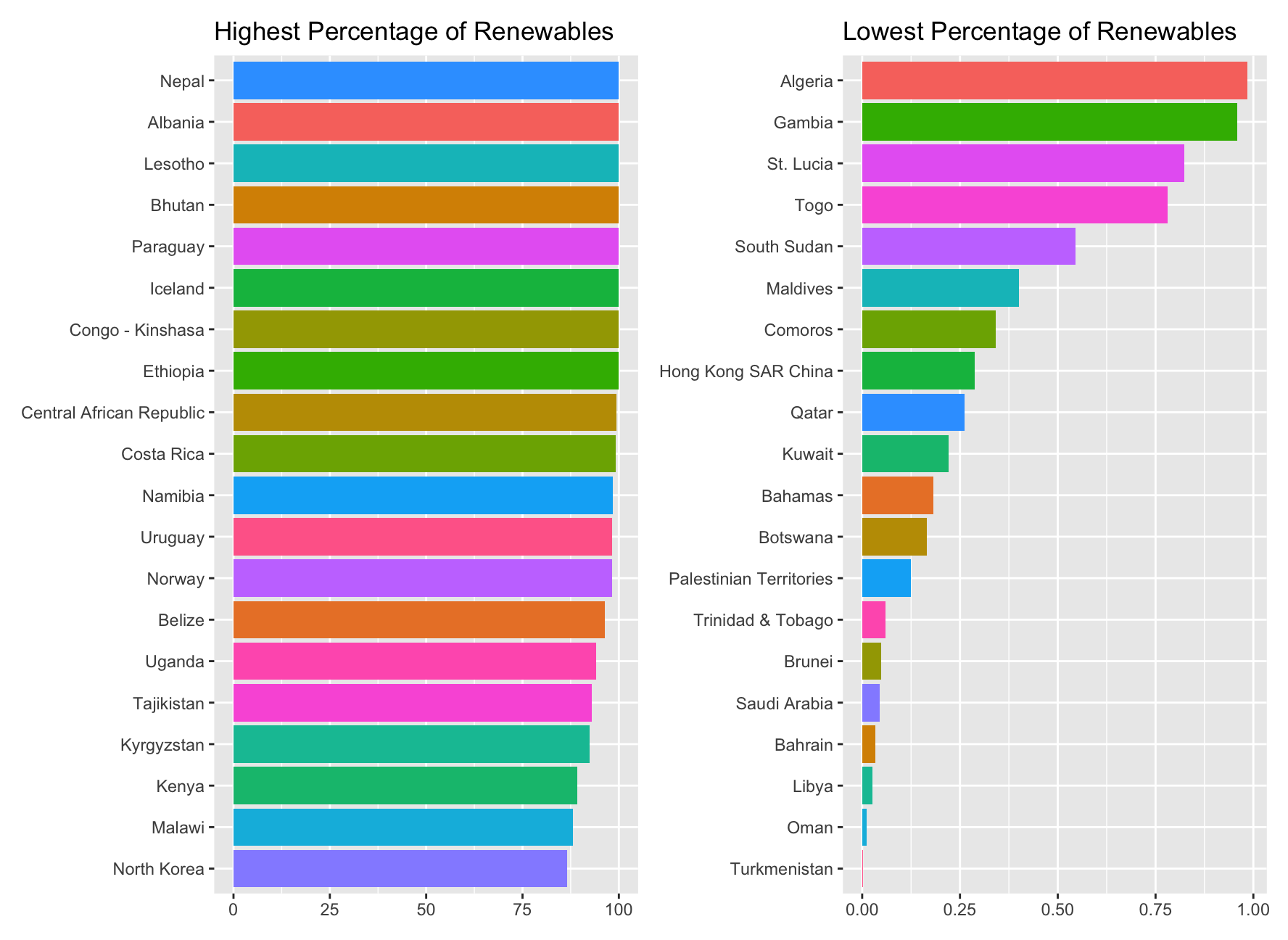
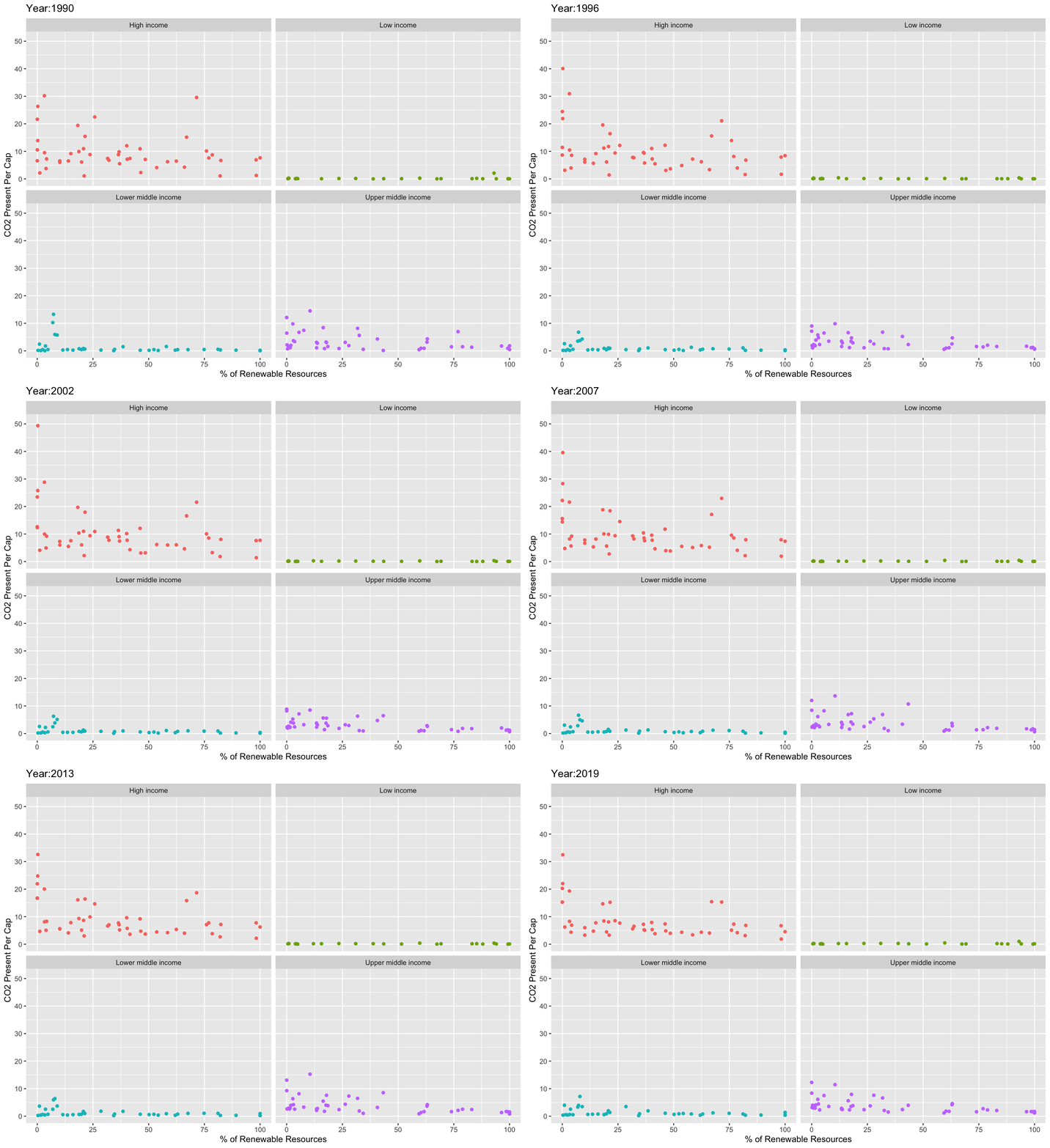
Secondly, we produced an animation to explore the relationship between CO2 per capita emissions and the deployment of renewables.
- As the % of energy generated by renewables goes up, CO2 per capita emissions do seem to go down
library(gifski)
library(png)

new_co2_percap <- merge(co2_percap, countries, by="iso3c") #merge all the data into one  dataset
new_co2_percap <- merge(new_co2_percap, en_new, by="country")

library(gapminder)
library(gganimate)
library(av)
library(tibble)
data <- new_co2_percap[,c(1,2,6,7,9,21)] #selecting columnns from above dataset
library(rmarkdown)

#plot and animate the graph
ggplot(data, aes(x=percent, y=value, color=income_level)) +
  geom_point() +
  facet_wrap(~income_level, nrow = 2) +
  labs(title = 'Year:{round(frame_time, 0)}',
       x='% of Renewable Resources',
       y='CO2 Present Per Cap') +
  transition_time(date) +
  ease_aes('linear') +
  theme(legend.position = "none")